בס״ד

Shira Herman

UX/UI/Marketing/Graphic Design/Project Management
862-812-9288 | sbhdezigns@gmail.com

Video Center Revamp

A full redesign of B&H’s Video Center to revamp the design and make it a more engaging, intuitive platform that keeps users exploring — and connects them back to the shopping experience.

See it Live

The Challenge

The original Video Center had:

  • Outdated design

  • No search capability

  • Basic navigation that made it hard to explore content or find relevant videos

Business pain point:
Stakeholders felt the platform didn’t reflect the quality or breadth of B&H’s video content.

My Role

As the UX Designer, I led the project end-to-end:

  • Conducted competitive research

  • Created and tested mockups

  • Designed the full experience

  • Collaborated closely with developers and stakeholders throughout implementation

The Process

Research:
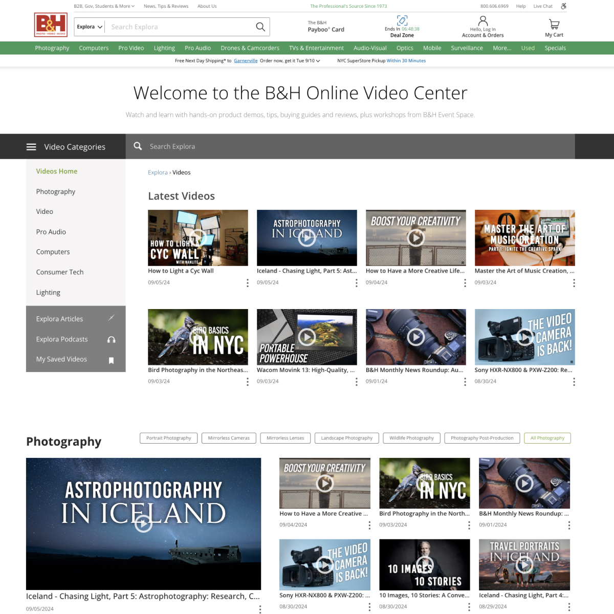
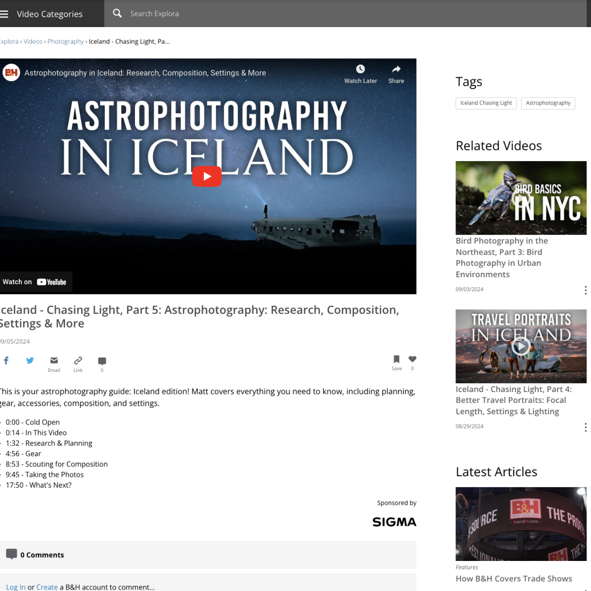
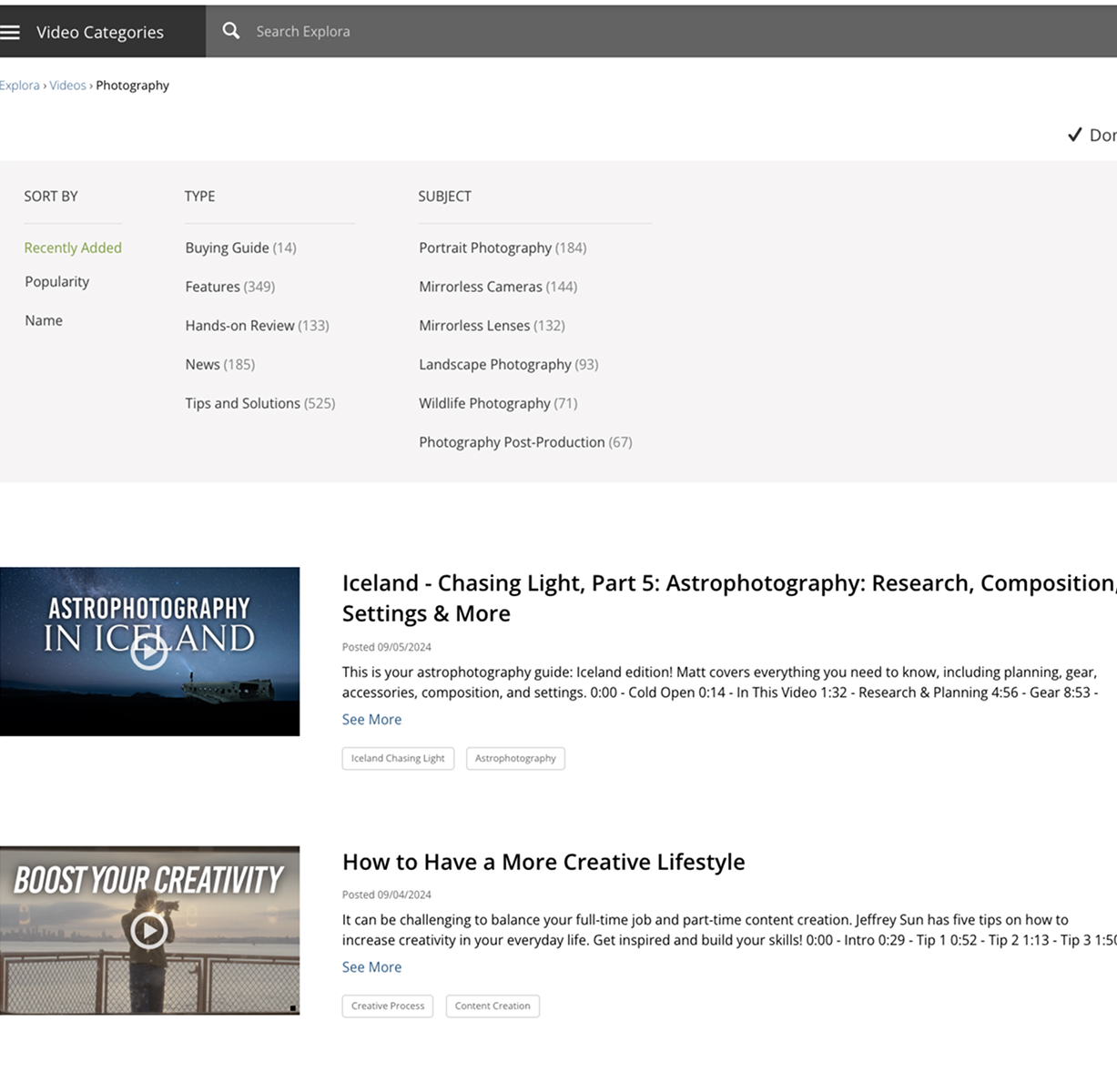
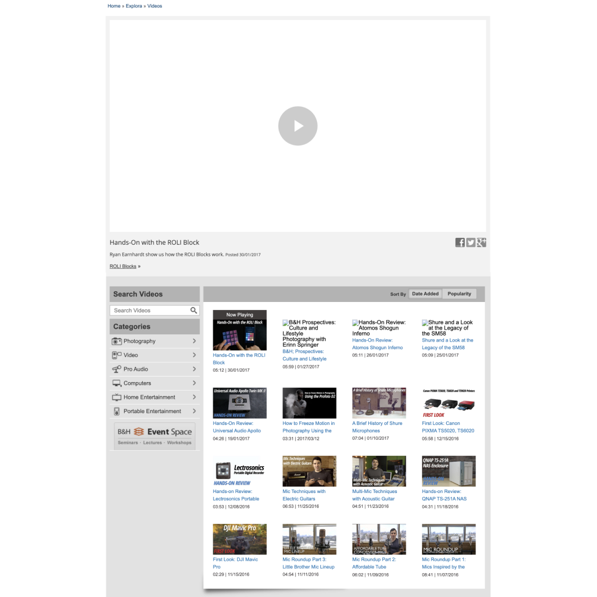
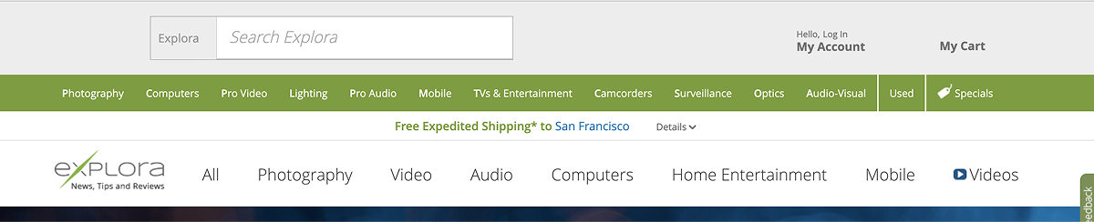
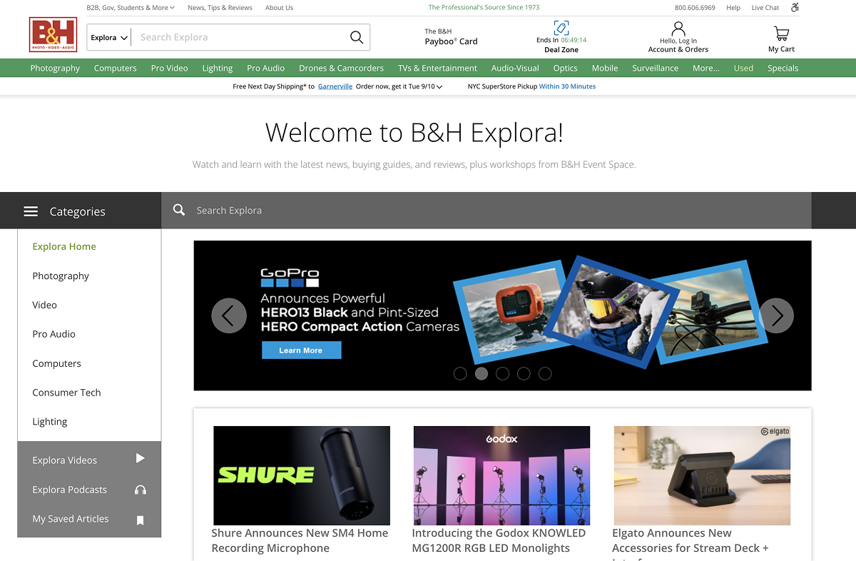
I audited other video platforms to identify best practices, gaps, and UX patterns we could learn from.

Design & Testing:
I designed high-fidelity mockups and ran usability tests using the UserTesting platform to validate layout, content, and functionality.

Iteration:
Test insights informed refinements to layout, navigation, and interaction patterns.

Collaboration:
Worked with developers to ensure technical feasibility and smooth implementation. Trained stakeholders on content strategy and system use.

The Solution

The redesigned Video Center introduced:

  • A dynamic homepage with featured videos and topic summaries

  • Filterable categories and tag-based navigation

  • Social interactions: like, comment, share

  • A redesigned comment section for better engagement

  • A right-rail feed with related videos, articles, and products to connect content back to commerce

Bonus: I also redesigned the global navigation for Explora to improve user flow site-wide.

Impact

While we didn’t capture detailed metrics at launch, the project was considered a success internally:

  • Users were more engaged

  • Stakeholders were excited about the new capabilities and improved user flow

  • The new design integrated seamlessly with e-commerce touchpoints, increasing content value

Personal takeaways:

  • I learned the importance of starting with low-fidelity wireframes to avoid rework

  • More upfront user research would’ve validated ideas earlier and saved design time

  • Trusting UX instincts, backed by thoughtful inspiration, created real value — but I’ll always look for data next time

Visuals

Before:

  • The Design was outdated

  • The technology was using flash so it had to be redone on the backend as well.

  • It gave the appearance of not having too much content although we have a tremendous amount of information on the video center.

  • It was disconnected from our website, it needed to feel more like part of our website.

After:

  • Added search capability.

  • Used tags to allow customers to find related content

  • Added bookmark, like and share interactions to give it a more social feel.

  • Added related videos on the detail page views

  • Added refinements to the listing page.

  • designed icons

  • designed comments section and interactions

  • added related videos/articles to the side panel as well as suggested products

Bonus - Upgraded Navigation

After

  • Moved the search lower with a big “welcome to B&H Explora” to divide the main shopping menu.

  • Made the categories exposed on the home page so that it is clear to the customers, but they hide on all subsequent pages.

Lets Get in Touch!

Phone: 862-812-9288
Email: SBHDezigns@gmail.com